
.svg)
While the Summary dashboard gives you a brief overview of the engagement, the Engagement Analytics dashboard is dedicated specifically to representing how interactive the community has been in the selected time frame. All data here is represented graphically.
You can choose to filter engagement analytics based on integrations and channels. Toggle between all community platform integrations and view the data accordingly.
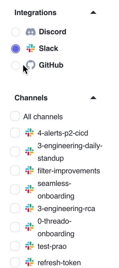
💡 If you select Slack for example, you will get a list of all the channels you have on your Slack community. The data is by default shown for all channels, but you can choose to filter the data from specific channels. You can make multiple selections too.
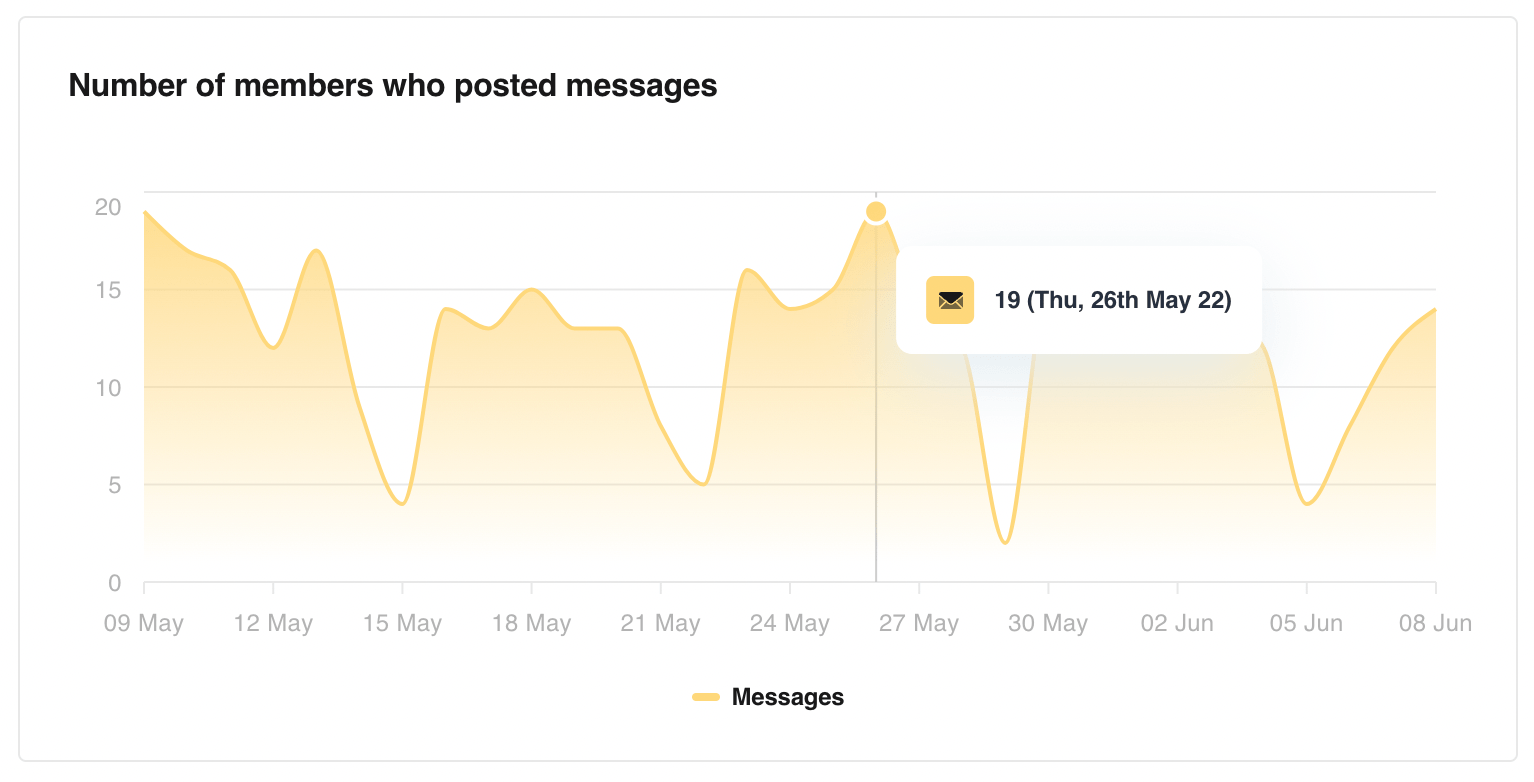
Right at the top, we have a graph that represents the Number of members who posted messages in the community. The data automatically updates as you change the selected date range.
Hover over the graph to see more details. This makes it easier to comprehend the data. For example - the image above shows expanded details for the 26th of May 2022 and you can see that there were 19 members who posted something in the community that day. It’s that intuitive!
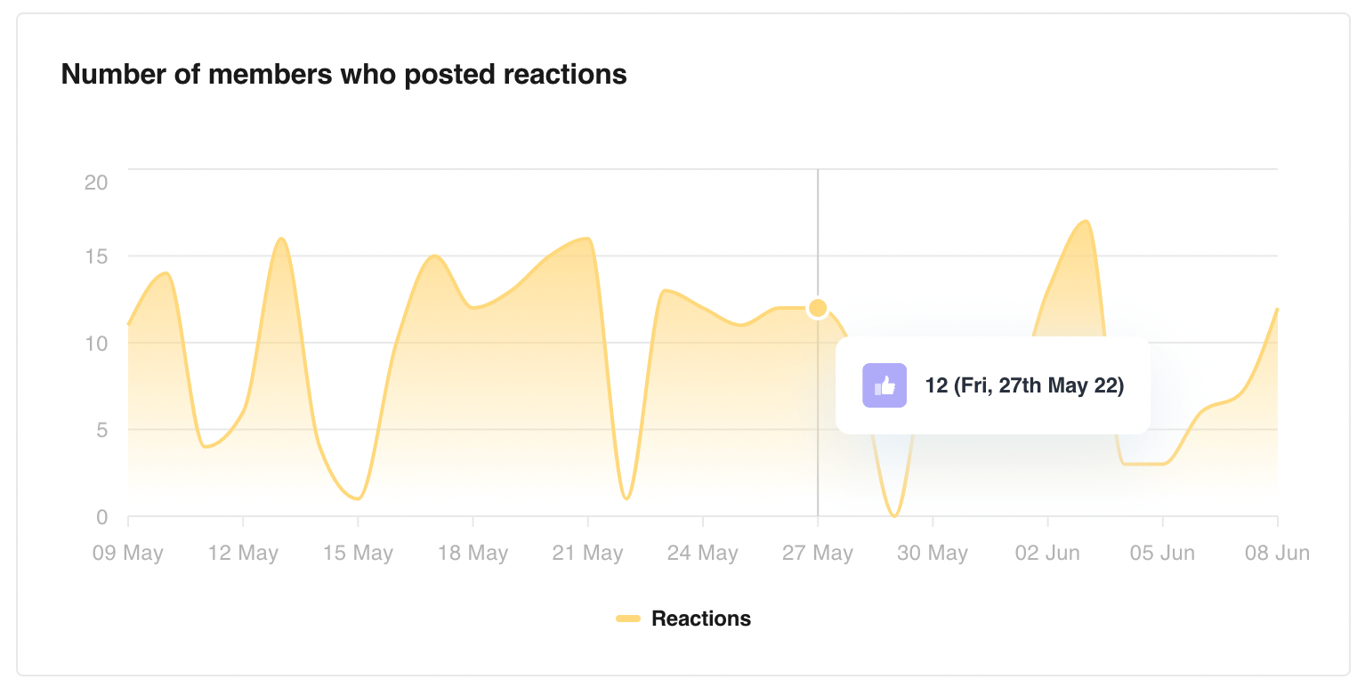
The next graph shows you the Number of members who posted reactions or simply put - members who reacted to a post in the community.
From the example, in the image, we see that on 27th May 2022, 12 members reacted to posts in the community.
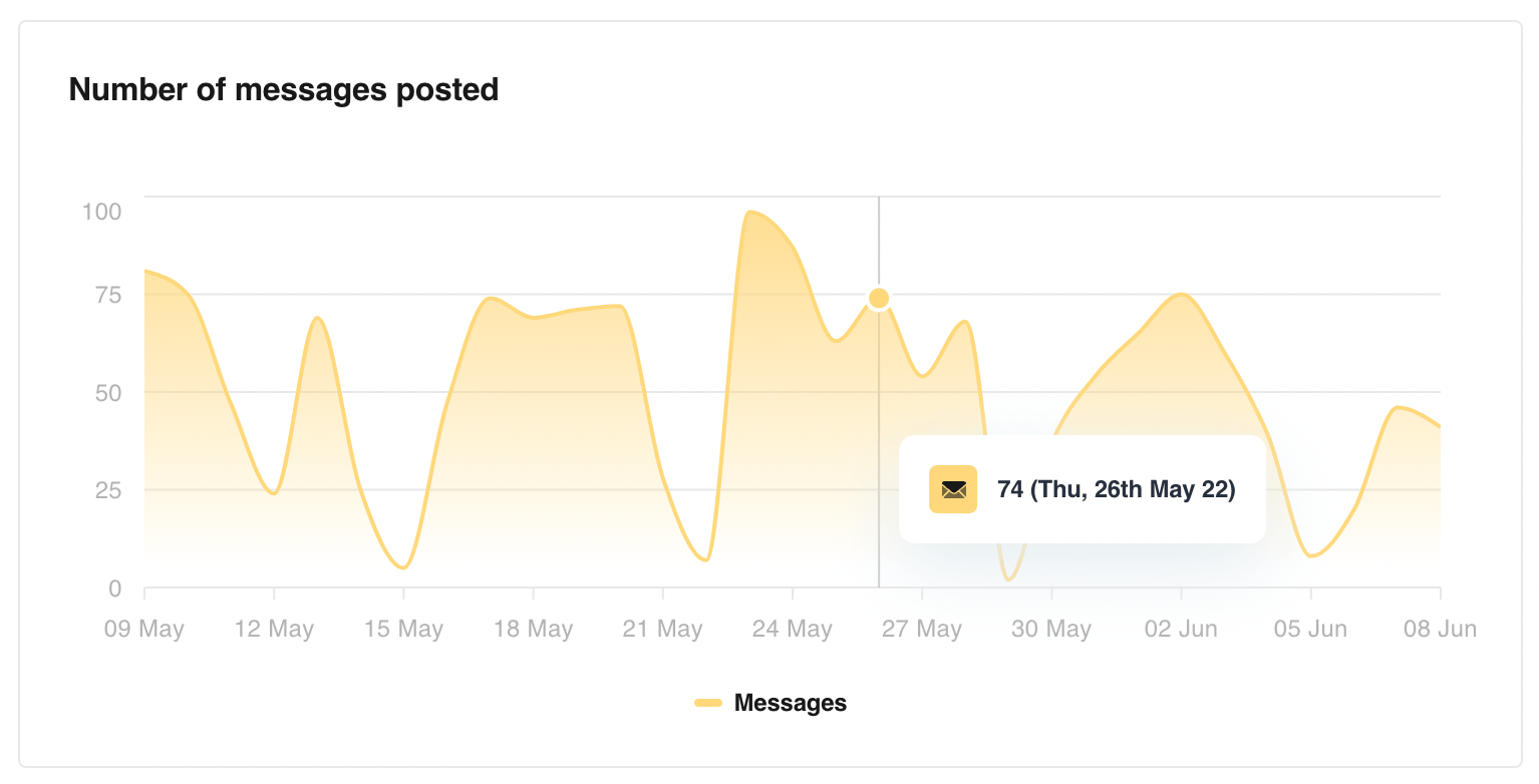
Not only can you see the number of members who posted messages but also the total Number of messages that were posted by those members in the community.
From our previous example, we saw that 19 members posted messages on 26th May 2022. From this graph, we can see that those members collectively were responsible for 74 messages in the community.
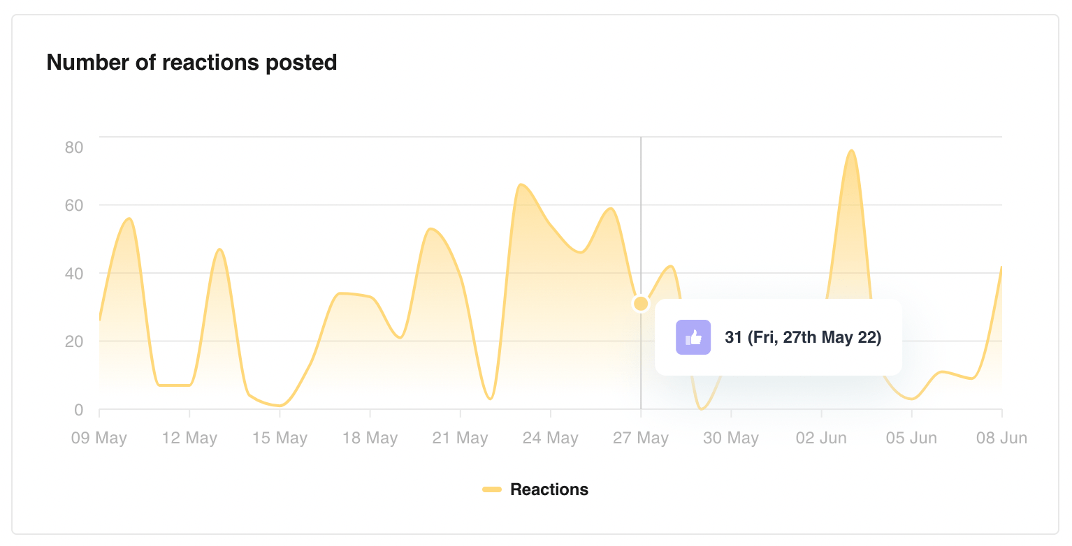
It only makes sense to have one for the total Number of reactions posted as well.
We know that on 27th May 2022, 12 members posted 31 reactions in the community.

.svg)
the command center for community builders

© 2023 Threado Inc